Spend Control: one limit for everyone was the wrong shape
A fifteen-year-old procurement product was being retired into the website, and the replacement gave every buyer in a company the same spending limit. Three rounds of testing across three countries said the same thing in three languages. This is the story of the limit becoming a curve.
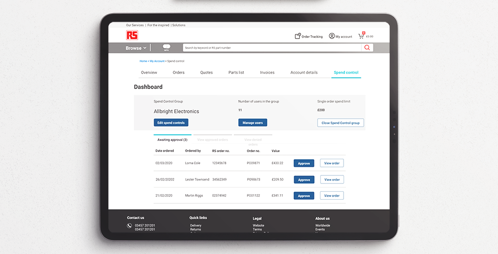
- Role
- UX design lead — project inherited at handover
- Product
- Spend Control (formerly Spend Management), RS Components
- Surfaces
- My Account web, desktop & mobile, email notifications
- Replacing
- Purchasing Manager, a ~15-year-old legacy tool
- Evidence base
- Three testing rounds across the UK, Germany and Italy
Brief
Build an online self-serve tool that lets small companies manage what they spend with RS. The first release focused on one thing: getting a first-time user set up.
RS Components serves three broad customer types — general customers such as independent tradespeople, key accounts (small businesses from around five people upwards, and a substantial share of the business), and corporate accounts running across many sites. This project sat in eProcurement, which splits in two: customers whose own purchasing systems integrate directly with RS, and customers who used a product called Purchasing Manager.
Purchasing Manager was about fifteen years old. The decision was to retire it and rebuild the capability inside the website — and to treat the migration as an opportunity to change the process rather than reproduce it. That framing mattered, because a like-for-like port would have been the cheap answer and would have carried every one of the old product's assumptions across with it.
The core loop was short enough to state in three steps: an administrator sets up a team, inviting members, allocating roles and allocating spending thresholds; a purchaser buys on the website; if that purchase exceeds their limit, an approver reviews it and either approves or declines. Everything else — audit, notifications, leavers, budgets — hung off that spine.
Inherited, not started
I picked this up at handover in April 2019, from a UX architect moving off the project, with the first round of user testing already scheduled for two days later. The prototype existed in Axure, the design language was the in-flight My Account refresh, and the components and states had explicitly not been broken down yet. So the first job was not design. It was working out what was actually true.
Problem statement
Four problems, and only one of them was on screen.
The control model was too blunt to be adopted
The first design set a single monthly budget and a single order limit for everyone in the group. Every participant who ran a real approval process told us some version of the same thing: their people do not all have the same authority, so a tool that pretends they do cannot be used. One tester was explicit that individual limits alone would dramatically improve his rating of the product. A flat limit does not just under-serve — it inverts. It sends small routine orders from senior people to approval, while a large order from a junior buyer with a matching limit sails through.
The tool assumed a workflow most participants did not have
Repeatedly, testers said approvals in their business happen by phone or by email, or that the owner wants to know the reason for every purchase and will not delegate it to a threshold. Others already had an internal requisition process and saw the tool as duplicating it — one said flatly that it doubled their work. The product was not competing with nothing; it was competing with a phone call and a spreadsheet, both of which are fast.
The setup journey did not tell you how to move through it
In the first round, users could not see how to advance from one setup stage to the next — one tried to drag the spend slider to progress. Group members were pre-selected by default, which led testers to assume they had already been added, so they disengaged from the very screen the release was built around. The warning message explaining that unchecked users would be excluded was rendered in a tint too subtle to read, and went unread by the person it was written for.
The research itself was not reliable enough to design from
In one round, participants were recruited who had no use for the product at all — a team too small to need spend control, a purchaser who already controlled all spending personally. Sessions asked candidates what features they wanted rather than observing them attempt tasks; there was no consistent scenario or task list; one session moved to mobile mid-round, another stayed on mobile and never showed the desktop design. Some of those sessions produced almost nothing usable. Treating that as a data-quality problem rather than a personality problem was, in hindsight, the most consequential call I made on the project.
We were designing an authority model with one dial, for companies whose authority is a hierarchy, on evidence gathered from people who did not need the product.
Proposed solution
Five moves, in the order they had to happen.
1 · Give the limit a shape
Replace one group-wide limit with a per-person model: an order-placer limit for each buyer, an approver limit for each approver, and an explicit no-limit state for the people who need one. Because setting eleven limits by hand is its own friction, an apply-to-all control sets the baseline in one action and leaves the exceptions to be edited individually. The default is fast; the detail is available. By version 6.04 the group-wide limit field had been removed from the edit screen altogether.
2 · Make the setup a numbered, four-stage commitment
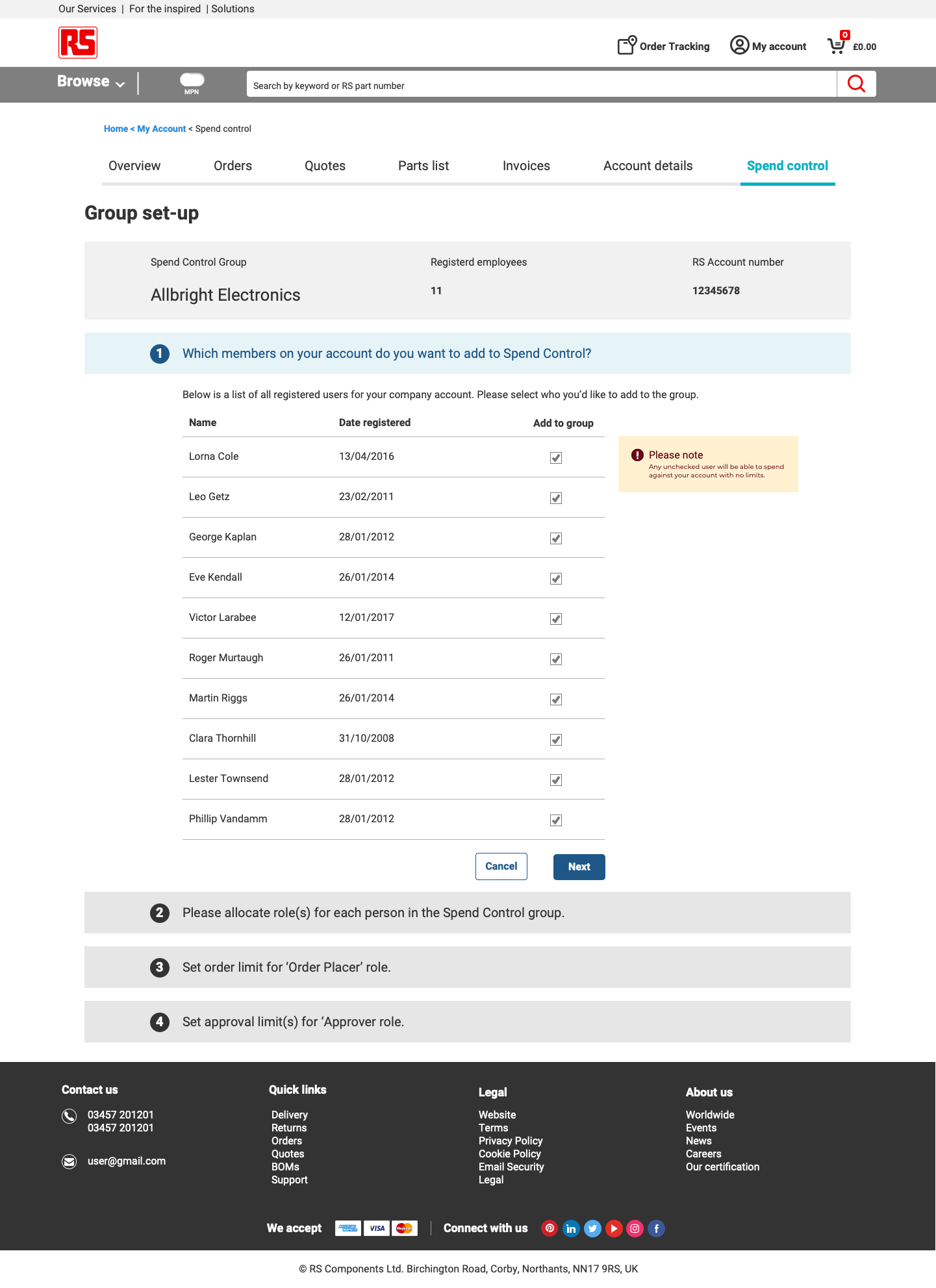
Company setup became four explicit stages — which members are in the group, what role each of them holds, what each is allowed to place, and what each approver is allowed to approve — with the stage number carried in the interface so the user always knows where they are and how much is left. The pre-selection default was challenged directly: making users actively select their group is slower and more engaging, and stops people believing the work is already done.
3 · Make the dashboard the hub, and let roles be implied
All functionality routes through the dashboard; other pages do not carry functional links. Three roles — Administrator, Approver, Order Placer — combine seven ways, and people commonly hold more than one. An early attempt to signpost the active role explicitly was built and demoed, and the team did not respond well to it. The resolution was to stop labelling the role and simply show the functionality that role grants, with a dedicated all-roles dashboard for the combined case.
4 · Constrain the approver deliberately
Approvers approve or deny. They do not edit the order. This was proposed during testing and I argued against it: an approver who can silently alter quantities or lines creates an order nobody has agreed to, and an audit trail that lies. What approvers got instead was a comment field, so the reason travels with the decision, and a full order view — items, delivery, payment method, order summary, and a stated reason for the request.
5 · Design the states nobody had budgeted for
Day-one empty states for every role, the confirm step before removing a user, the error case where a spend band is selected but no value entered, the collision message when someone at your company has already created a group, the leaver, and the notification model. These are where the release either feels finished or does not.
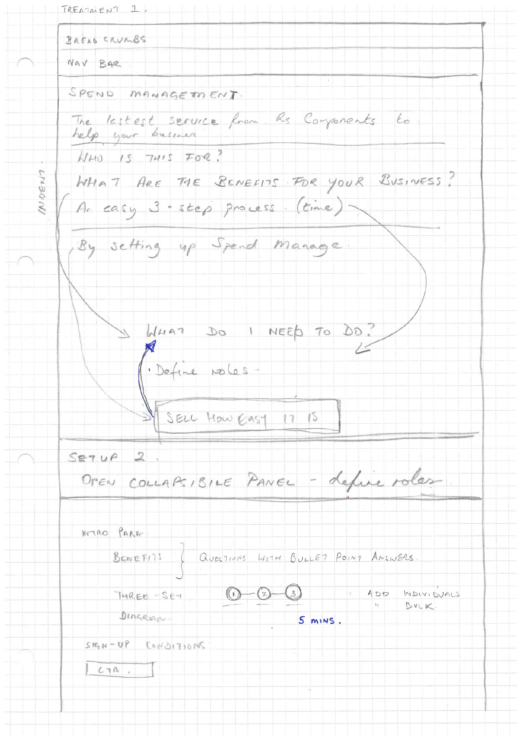
FIGURE — OVERVIEW SCREEN REDESIGN, SKETCH TREATMENTS
Research & competitive analysis
Evidence came from three testing rounds spread across a year and three markets, plus the incumbent product itself.
| Round | When | What it settled |
|---|---|---|
| UK — first prototype test | April–May 2019 | Setup-journey mechanics: progression, pre-selection, warning legibility, mobile approve/deny parity |
| UK — mid-project interviews | July–August 2019 | Mostly a lesson in recruitment; one clear demand for individual limits and for approval-decision emails |
| Germany & Italy | December 2019 | Export, project and cost codes, item-level rejection, stock availability, ratings of 4/5 and 5/5 |
The incumbent as a source. Purchasing Manager was studied as a competitor in its own right, because it is what customers were being moved off. Its audit function set the bar for what had to survive the migration — searchable by change type (add, delete, edit, assign, unassign), by category (users, roles, controls) and by date range, returning the originator, the timestamp, what changed, and the pre- and post-values, on a ninety-day rolling archive, paginated, admin-only. Its blanket-order mechanic, which allocates budget against cost codes, was the origin of the recurring question about linking to project budgets.
External benchmarks. Amazon Business was reviewed for its business-group functions, spending overview, per-user spending limits and its purchase-order step in the checkout flow — that PO step was the direct reason the checkout entry point was added to our journey. A B2B eProcurement suite was also cited by the product team as a reference for the landing-page grid arrangement.
Interviews
Three rounds, and they did not carry equal weight. Saying so is the point. Participants and their companies are generalised here to firm type and market.
Round one — the mechanics round
The most productive UK session ran desktop and mobile back to back with a participant who read the interface properly, including the terms and conditions. It produced almost every setup-journey finding the project ran on for the next six months: no obvious way to proceed, pre-selection creating false completion, the warning tint failing, the tooltip working well, quick-approve on mobile shipping an approve button with no matching deny.
Round two — the recruitment round
Three sessions with participants who, between them, had a team too small to need the tool, an existing process they had no intention of leaving, and a seniority level below the decision. One participant became visibly anxious when confronted with a product irrelevant to her work and a call full of observers. One left after twenty-five minutes. The findings that survived were narrow but real: individual spend limits, and email notification both when an approval is requested and when it is granted or denied.
The methodological problems were as informative as the outcomes. Asking candidates which features they want — and implying those features will be built — produces a wish list, not a design input. What we needed was how they work now, where that work breaks, and how it would migrate.
Round three — the international round
Germany and Italy, and the strongest round by a distance, because these participants had live requisition processes to compare against. Ratings of 4/5 and 5/5, each with a stated condition attached to the missing point.
Their process was a paper requisition form, collect all the signatures, then send it to purchasing. Spend Control collapses that to: basket, approval, order.
Manufacturing customer, Italy — paraphrased from session notes
Affinity mapping & key findings
Clustering three rounds and two markets produced five themes. The first two changed the product; the last three changed the roadmap.
1 · Authority is individual
The single most repeated finding across every round and both markets. One limit for all employees was described as far too limiting; participants wanted per-person limits, and separately raised group, project and budget-level limits tied to the work rather than the person. This is the finding that reshaped the setup journey.
2 · The order record has to leave the system
Every Italian participant independently asked to export order details — Excel first, PDF and CSV acceptable. The reason was consistent and not about convenience: they have to re-enter the order into their own portal, and re-keying is where mistakes are made. One participant put the entire missing point of their 4/5 rating on this one feature. The counter-consideration raised internally was security around spreadsheet ingestion, with PDF or an API suggested as the safer route.
3 · Codes are how spending is actually tracked
Cost centre and project code came up as fundamental business needs, not enhancements — one participant was planning individual project budgets and tracked spending by project number with quarterly analysis. GL code, present in the design, meant nothing in Italy; an Italian-specific procurement code meant a great deal. The conclusion is a custom-field capability, not a longer list of fixed fields.
4 · Approval has a clock on it, and the catalogue moves
The design assumed availability held while an order waited for approval. Participants pointed out that stock can go while the approval sits, so the approver needs to see stock level at the point of decision, and the order placer needs a route to cancel an order that has been approved too late to be useful. That cancellation also needs to be recorded as cancelled rather than denied — different data, different diagnosis, and the only way to see whether approval delay is causing drop-out in the purchase funnel.
5 · Consistency failures cost trust disproportionately
Quick-approve on mobile offered approve with no deny. Manage users warned about removal in language that read as permanent deletion. Terminology was inconsistent — an internal account reference was exposed to customers under a different name, and roles were named in ways that did not register with the people holding them. Each is small. Together they read as a product that has not been finished.
Nothing in the top two themes was a usability problem. They were model problems, found through a usability test — which is the argument for testing before the model is locked, not after.
Personas
The project ran on roles rather than formal personas, and the roles were load-bearing — they define what each person can see, do and combine. Three of them, and one that was argued for.
Administrator
Sets the group up and maintains it. Adds and removes members, allocates roles, sets and edits limits, and is the only role with access to the audit trail. Cares about doing setup once and correctly, and about not having to rebuild it every time someone joins or leaves. Sees the landing page, all four setup stages, manage users and edit spend control limits.
Approver
Reviews orders that exceed a placer's limit and approves or denies them. Wants enough context to decide without a phone call — items, value, requester, stated reason, and stock position. Cannot approve their own order. Sees the approver dashboard and the order view.
Order Placer
Buys. Wants to know whether an order needs approval before submitting it rather than after, wants to see what is pending, approved or rejected, and wants their remaining budget visible. Sees their own orders only.
The role that was proposed and not built
A view-only role, argued for so that finance can see orders without being able to place or approve them. It did not make the release. It is the obvious fourth role and it maps to a real reader, which is why it is worth naming rather than quietly dropping.
Why the combinations mattered more than the roles
In a company of eleven people, one person is often all three. Every combination needed a defined day-one state and a defined steady state.
| Combination | Admin | Approver | Order Placer |
|---|---|---|---|
| Administrator | ● | — | — |
| Approver | — | ● | — |
| Order Placer | — | — | ● |
| Administrator + Approver | ● | ● | — |
| Approver + Order Placer | — | ● | ● |
| Administrator + Order Placer | ● | — | ● |
| All three | ● | ● | ● |
The only hard constraint across all seven: nobody approves their own order, however many roles they hold.
Problem statements
The findings restated as points of view — one per role, plus one for the business.
- Administrator. I need to reflect how authority actually works in my company, but the tool gives me one limit for everyone — so either I set it high and lose control, or I set it low and bury my approver in routine orders.
- Approver. I need to decide on an order without picking up the phone, but I cannot see why it was requested or whether the stock will still be there when I say yes — so I call anyway, and the tool has saved me nothing.
- Order Placer. I need to know whether my order needs approval before I submit it, and what happened to it afterwards — but I find out by waiting, and if approval takes too long I have no way to withdraw.
- Finance / the record-keeper. I need this spend to land in our own system against the right project and cost centre, but I have to re-key every order by hand — so the tool that was meant to reduce admin has added a transcription step.
- Business. We need customers to move off a fifteen-year-old product willingly, but the replacement launches with a cruder control model than the thing it replaces — so the migration is a downgrade for exactly the accounts we most need to keep.
Those five set the success criteria: individual authority, decision context, status visibility, exportability, and parity-or-better with the incumbent.
Ideas & iterations
Six numbered prototype generations over roughly a year. The version history is the process record.
| Version | When | What changed |
|---|---|---|
| UT round 1 | April 2019 | Inherited Axure prototype, desktop and mobile, setup journey only |
| 4.0 | July 2019 | Setup 1 and 2 merged; overview screen reframed around questions rather than boxes; order details restructured to mirror the incumbent's approvals screen; breadcrumbs added |
| — | September 2019 | Product renamed from Spend Management to Spend Control; role names revisited; tabs moved to the design system pattern |
| 5.02 / 5.03 | Late 2019 | Setup restructured again; monthly budget questioned in favour of total monthly spend |
| 6.01 | March 2020 | Desktop-only rebuild: four-stage setup, role-specific dashboards, single-user delete with confirm, error handling and logic documented |
| 6.04 | 2020 | Group limit removed; per-person order-placer and approver limits with no-limit and apply-to-all; pending status and available budget added to the order-placer dashboard |
The three decisions that came out of it
Merge, then split. Setup went from three steps to two and back out to four. That is not indecision — the two-step version hid the fact that placing limits and approving limits are different decisions made by different people about different people. Four stages is longer and clearer.
Reframe the overview as questions. The landing page moved from descriptive boxes to the questions a first-time user actually has: who is this for, what does my business get, what does it do, what do I have to do. Paired with a stated step count and an easy-to-set-up promise, it converted a wordy page into a decision.
Drop the group limit rather than add to it. The tempting fix was to keep the group limit and layer individual overrides on top. Removing it outright made the model comprehensible: every person has a limit, and the shortcut sets them all at once.
User journeys
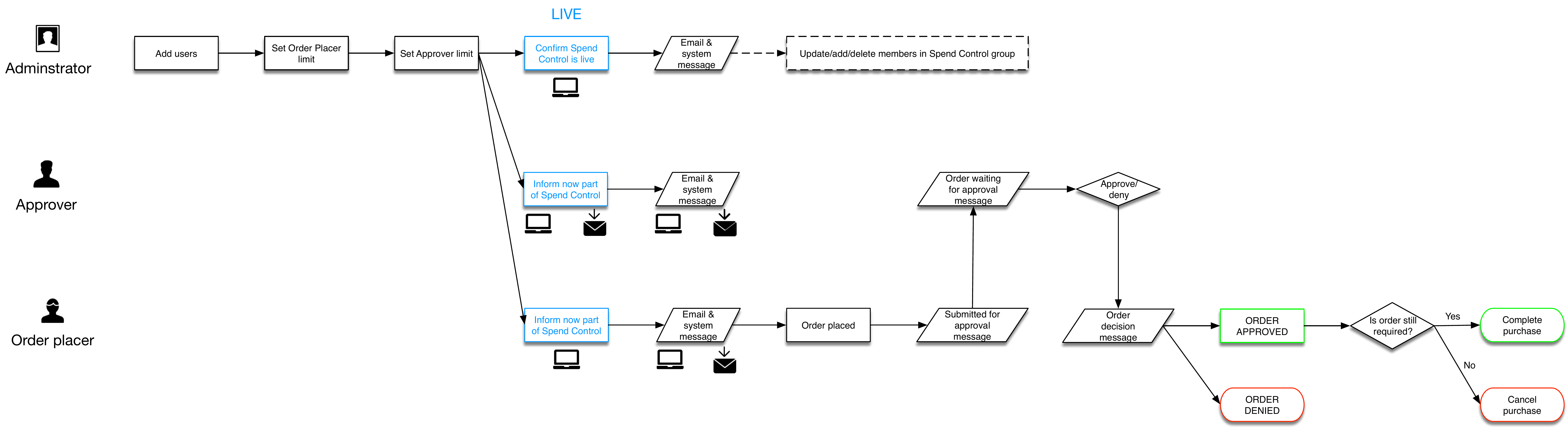
Through most of 2019 the UX covered the setup phase and the approver's dashboard, and nothing else. The order placer's journey — what happens after you submit — was undocumented, as was how anyone finds out that a decision has been made. Mapping that gap was the piece of work that unlocked version 6.
The questions the map was built to answer
- Where does an approver land? Straight to the Spend Control dashboard, or to My Account with a flag on the panel showing how many approvals are pending. The flag did not exist on the account dashboard; it was a request, not a given.
- Where does an order placer land after a decision? To a summary of approved and denied orders, with an acknowledgement step — because a decision the buyer has not seen is not a completed transaction.
- When is the limit actually checked? Four options were laid out: check on submit and warn immediately (preferred), submit-then-auto-deny (efficient, unpleasant), send to the approver flagged as over-limit, or no automated check at all. Checking at submit is the only one that respects the buyer's time.
- What about the genuine exception? An engineer who needs a specialist part above their limit is not an error. Any automated check has to have an escalation path or it will simply be worked around.
- What happens when it takes too long? The buyer cancels — and that has to be recorded as a cancellation, distinct from a denial, or the funnel analytics will misattribute abandonment to rejection.
Alongside the flow, email is the second surface: notification on submission, on approval and on denial. The volume question was raised in testing and never fully answered — which email types exist, how often they fire, how a user controls them, and whether there is a notification centre.
FIGURE — SPEND CONTROL USER JOURNEY, VERSION 2.1
Prototypes & feedback
Version 6 is a connected desktop prototype of fifteen frames covering every role path. The states that carried the learning:
- Company setup, stages one to four. Members, roles, order limits, approval limits — each with the stage number persistent. Stage three carries the fork: all orders require approval, or allowed to place orders up to a value.
- Three dashboards plus a fourth. Admin-only, order-placer-only and approver-only views, and then an all-roles dashboard for the person who is all three. Building the fourth is what proved the role model actually resolved.
- Delete users, with a confirm. One user at a time in this version, with an explicit are-you-sure step. Multi-delete was deliberately deferred rather than half-built.
- View order. The approver's decision screen: items, quantities, delivery and invoice addresses, delivery and payment method, order summary with VAT and grand total, the requester's stated reason, and an approver comment field that travels with the decision.
- The order-placer dashboard, twice. In 6.01 it showed approved and denied orders with a mark-as-read control. In 6.04 it gained a pending status, a rejected label in place of denied, available budget, and mark-as-unread. The buyer went from seeing outcomes to seeing the whole queue and their remaining headroom.
FIGURE — PROTOTYPE VERSION 6, KEY FRAMES
Wireframes & earlier versions
The early work was Axure, desktop and mobile in one file, on a design language that was itself mid-refresh — which produced a known transition period where old and new My Account styles would coexist in production.
What the mobile review exposed
Reviewing the mobile designs against the desktop set surfaced problems that were not really mobile problems. The account area had seven navigation tabs; mobile showed three, and only one of those belonged to this team. Icons carried specific currency symbols in a product intended to be global. Only two breakpoints were mapped where four were needed. The desktop overview page was, in the review's own word, very wordy.
The layer underneath
Version 6 arrived alongside a documented set of error states and underlying logic rather than screens alone — an error state for a spend band selected with no value, the collision message when a second person tries to create a group that already exists, and per-role day-one empty states. Writing that layer down is what turned a demo into something a team could build against, and it is the least glamorous and most useful artifact in the project.
Next steps
Where the work stood, in the order I would pick it up:
- Custom fields — project code and cost centre. The most repeated unbuilt request, and the one that connects Spend Control to how customers already track spending. Without it the tool records purchases; with it, it records budgets.
- Order export. Excel, CSV or PDF from the order detail screen. Named by multiple participants as the difference between four out of five and five out of five, with the security question on spreadsheet ingestion to be answered first — PDF or an API being the safer route.
- Define the notification model. Which emails exist, when they fire, how a user turns them down, and whether there is a notification centre. Raised in the first round of testing and still open at version 6.
- Stock position at the point of approval, and buyer cancellation. With the cancelled state recorded separately from denied.
- The leaver journey. Currently treated as general account admin. Somebody leaves, their limit and role persist, and nothing prompts the administrator. A flag in the user table with an acknowledge action is the small version of the fix.
- Item-level rejection. Approve or deny currently applies to the whole order. Participants wanted to reject a line — which needs its own messaging, error handling and repricing logic, and is bigger than it looks.
If I were picking one, it is the first. Export and notifications make the tool pleasant. Project and cost codes make it the system of record, and that is the only version of this product a customer does not eventually route around.
What I would take to the next problem
The strongest finding in this project was not found by the research method; it survived despite it. Individual spend limits came up in a session with a badly recruited participant who spent most of his time explaining he would never use the product. Bad rounds are not empty rounds — but you only get the finding if you treat the session as data about the world rather than a verdict on the design.
Second: when a usability test keeps returning the same objection at different screens, in different languages, from different markets, it has stopped being a usability finding. One flat limit failed in the UK, in Germany and in Italy, on desktop and on mobile, at setup and at edit. At that point you are not iterating the interface — you are being told the model is wrong, and the cheapest moment to hear that is before it is built.
Third, and least comfortable: research quality is a design constraint like any other. Leading questions and mismatched recruits do not produce neutral data, they produce confidently wrong data. Handling that without turning it into a colleague's performance problem is a real skill.